
Data Visualization 101: Tips and Tricks for Creating Engaging Charts
How to design clear, engaging and informative charts for your data stories


Data visualization is the art and science of presenting data in a graphical or pictorial form. It can help us understand complex patterns, trends, and relationships in data, as well as communicate insights and findings to others. However, not all data visualizations are created equal. Some are more effective than others in conveying the intended message and capturing the audience’s attention.
In this blog post, I will share some tips and best practices for creating engaging and informative data visualizations. These tips are based on my own experience as a data scientist, as well as on the research and literature on data visualization.
Know your audience and your purpose
Before you start creating a data visualization, you need to ask yourself two questions: Who is your audience and what is your purpose? Your audience is the people who will see or use your visualization. Your purpose is the main goal or message you want to convey with your visualization.
Knowing your audience and your purpose will help you decide what type of visualization to use, what level of detail to include, what colors and fonts to choose, and how to explain or annotate your visualization. For example, if your audience is a general public who is not familiar with data science, you might want to use a simple and intuitive visualization that does not require much technical knowledge or background. If your purpose is to persuade or influence your audience, you might want to use a visualization that highlights the most important or relevant information and appeals to their emotions or values.
Choose the right type of visualization for your data
There are many types of data visualizations, such as bar charts, line charts, pie charts, scatter plots, maps, heatmaps, histograms, box plots, etc. Each type of visualization has its own strengths and weaknesses, and is suitable for different kinds of data and purposes.
To choose the right type of visualization for your data, you need to consider the following factors:
The number and type of variables in your data. Variables are the attributes or features of your data, such as age, gender, income, etc. Variables can be either categorical (nominal or ordinal) or numerical (discrete or continuous). Categorical variables have a finite number of possible values that represent categories or groups. Numerical variables have numerical values that represent quantities or measurements.
The relationship or comparison you want to show among the variables. Relationships can be either univariate (one variable), bivariate (two variables), or multivariate (more than two variables). Comparisons can be either within-group (comparing different categories within one variable) or between-group (comparing different variables across categories).
The distribution or pattern you want to show in your data. Distribution refers to how the values of a variable are spread out or clustered. Pattern refers to how the values of a variable change over time or space.
Based on these factors, you can choose the most appropriate type of visualization for your data. For example, if you want to show the distribution of a numerical variable, you can use a histogram or a box plot. If you want to show the relationship between two numerical variables, you can use a scatter plot or a line chart. If you want to show the comparison between two categorical variables, you can use a bar chart or a pie chart.
Use design principles to enhance your visualization
Once you have chosen the type of visualization for your data, you need to apply some design principles to enhance your visualization. Design principles are guidelines or rules that help you create effective and aesthetically pleasing visualizations. Some of the most common design principles are:
Simplicity: Keep your visualization simple and clear. Avoid unnecessary clutter or noise that might distract or confuse your audience. Use only the essential elements that support your purpose and message.
Contrast: Use contrast to highlight the most important or relevant information in your visualization. Contrast can be achieved by using different colors, sizes, shapes, positions, etc. For example, you can use a bright color to draw attention to a specific category or value in your visualization.
Alignment: Align the elements in your visualization along a common edge or axis. Alignment helps create order and harmony in your visualization. It also helps your audience follow the flow and direction of your visualization.
Consistency: Use consistent styles and formats throughout your visualization. Consistency helps create coherence and unity in your visualization. It also helps your audience recognize and understand the meaning of different elements in your visualization.
Balance: Balance the elements in your visualization according to their weight or importance. Balance helps create stability and symmetry in your visualization. It also helps your audience perceive the proportion and scale of different elements in your visualization.
Add context and explanation to your visualization
Finally, you need to add context and explanation to your visualization to make it more informative and understandable. Context and explanation are the additional information or text that accompany your visualization, such as titles, labels, legends, captions, annotations, etc. They help your audience interpret and comprehend your visualization.
To add context and explanation to your visualization, you need to consider the following aspects:
The title: The title is the name or headline of your visualization. It should be concise and descriptive, and capture the main idea or message of your visualization.
The labels: The labels are the names or descriptions of the axes, categories, values, etc. in your visualization. They should be clear and accurate, and use appropriate units and formats.
The legend: The legend is the key or guide that explains the meaning of the colors, shapes, symbols, etc. in your visualization. It should be consistent and visible, and use logical and intuitive categories.
The caption: The caption is the text or paragraph that summarizes or explains your visualization. It should be informative and relevant, and provide the main findings or insights from your visualization.
The annotations: The annotations are the notes or comments that highlight or emphasize specific points or details in your visualization. They should be helpful and specific, and use arrows or markers to point to the relevant elements in your visualization.
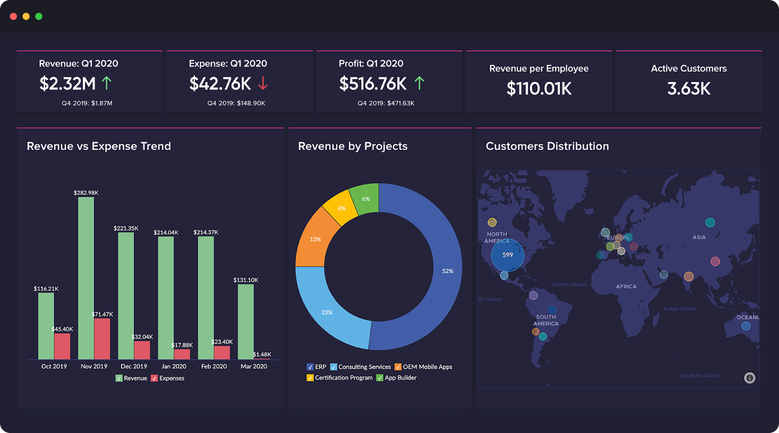
Here is an example of a data visualization that follows these tips and best practices:
Bottom Line
Data visualization is a powerful tool that bridges the gap between raw data and meaningful insights, unlocking the potential for better decision-making and communication. As we venture into the world of data visualization, we discover that it is not just a matter of presenting numbers and statistics in a visually appealing manner; it is an art that requires careful consideration of the audience, purpose, data type, and design principles.